Rizing Art and Flux’s Process

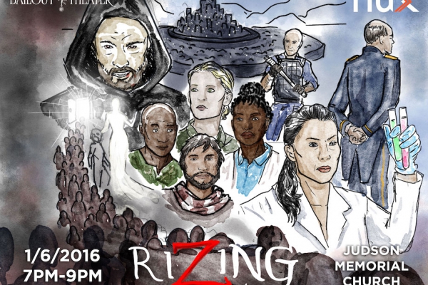
(Beautiful but slightly truncated featured image by Jason Tseng–see its full glory below!)
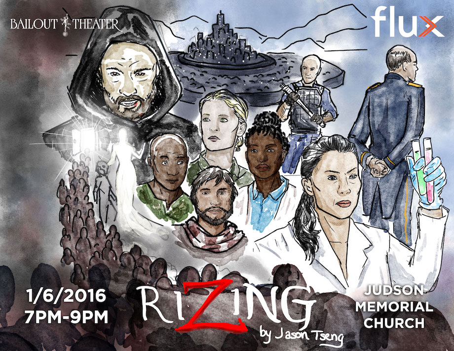
At this point, you’re probably well aware that Flux is all about collaboration (core value and all). But how exactly does that play out? A great example is the conversation that surrounded art design for our upcoming Food:Soul reading of the first act of Rizing, Jason Tseng’s amazing new play that we’ll be producing later this year. How did we arrive at the beautiful poster image that Jason created above?
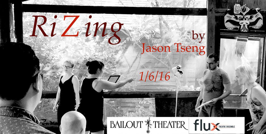
Here’s how it played out: we often need images for plays we’re developing before those plays have had the thorough design process that goes into our more polished world-building. When that happens, we try to give a rough feeling for the play–something that communicates both the spirit and tone of the play, but also that it’s a work in progress. Sometimes that will mean using images of actors developing the play, as we did with the initial Rizing image:
You see the playwright watching, the actors holding scripts, and if you know Flux well, you recognize Little Pond Arts Retreat. At the same time, the actors are circling a nervous looking Emily in a menacing way. Paired with the text on Facebook and FluxBlog, this gives you a rough sense of what you’ll be in for, while at the same time communicating “this is new play development.” I’d put this together quickly over the holiday to get the pages live, and let Flux’s brilliant graphic designers (Isaiah and Will) know that if they had time, they’d be welcome to make it prettier, but there was no real need.
But we can’t stop there, can we? Not with that restless perfectionist streak in Flux that always asks, “can we make this just a little better?” And this time, the impetus for that came from playwright Jason, who is also a brilliant visual artist (perhaps you know that side of his work best from his now famous Kaiser cartoon). So he shared this quick sketch he made, which does a great job of conveying the epic scope and layered narratives of the play:
Is there a world where things ended there, and we just shared this evocative sketch on Facebook to garner a little more interest in this fascinating play, and attendance at the reading?
Sure. But instead, we live in a world where graphic design wizard Isaiah Tanenbaum takes that image and does this:
Because why not dedicate this level of time and artistry to a developmental reading of the play’s first act?
Things didn’t end there, however. While dazzled by Isaiah’s skill, I was worried that the image was now too polished–did it begin to define the tone and spirit of the play before we’d had the conversations needed to inform that work? Director Emily Hartford and actor Alisha Spielmann jumped in with similar thoughts, and we wondered about featuring the actors of the reading, who may very well wind up in the full production (they are all amazing), but we haven’t gone through that casting process yet (though Alisha is signed on for Mica, hooray). Plus, did this poster veer to deeply into a delightful B-movie horror vibe, where Rizing itself is more nuanced and morally complex? How could we share this amazing image without setting up the wrong expectations?
Cue Jason’s amazing watercolor rendering of Isaiah’s version of Jason’s sketch (#collaboration). This works perfectly–it implies a work in progress because of the rough (yet gorgeous) nature of the illustration, moves the tone from horror to a more sci-fi graphic novel feel, and honors the actors in the reading without branding them as the actors of the eventual production:
Friends, this looks like it’s going to be an amazing process.


Recent Comments